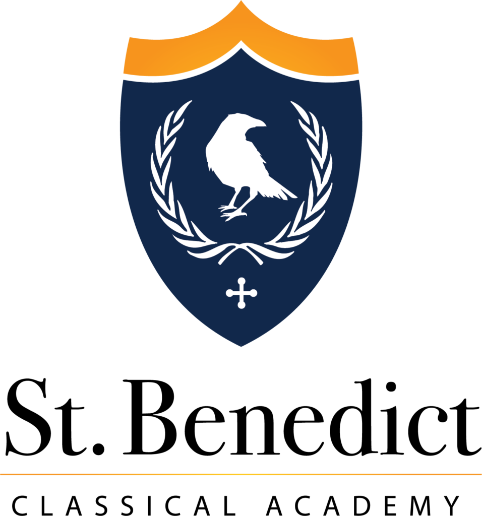
Our new name is not the only update we have made here at St. Benedict’s. At the top of this page, you’ll see our new logo, which also reflects the truth of our identity.
The font style, colors and layout are clear, simple, and classic – much like our approach to education – and there is meaning in each aspect of the graphic design.
The words “St. Benedict” are the focus of the new logo. Their prominence emphasizes our faith identity while invoking the name of our school’s patron. Underneath, “Classical Academy” supports and upholds “St. Benedict,” the same way our entire school community upholds faith and virtue through the strong foundation of a classical education. The imagery also holds significance for the St. Benedict community: the raven references the story of St. Benedict and the raven; the shield is a symbol of both strength and protection; and laurel wreaths have long been used to crown scholars. By using these images, we are reminded of the virtues of charity and obedience to God, the strength and protection His grace gives us, and the importance of education. The cross at the base helps us remember that our faith in Christ is the foundation of all that we do.
Our new name and logo better reflect who we are and who we aspire to be as a school and school community. We are, clearly and simply, St. Benedict Classical Academy, in words, image, and – with your help and God’s grace – in deed.

